Thursday, June 4, 2009
Wednesday, June 3, 2009
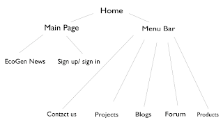
Website Rationale
Thursday, April 30, 2009
Wednesday, April 29, 2009
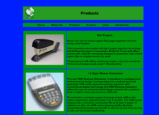
EcoGen website explanation
Wednesday, April 22, 2009
EcoGen space summary
Weekly Post 23 (Magazine)
Graphic (e)motion
This article from Matt Woolman demonstrates how motion graphics has changed the universe of multimedia. What I found interesting about this article is that he compared a graphic artist to a painter. With this comparison, he is trying to show that in the modern world both the painter and graphic artist are hesitating and are asking questions about what tool to use instead of asking the question what is possible. A painter has to choose between the water colors, the paint brushes and paint palettes while the graphic artist has to choose which software he is going to use for animations. The author of this article explains that the methodology is more important than the tool. No matter what software or paint tool is used, the design has to attract the attention and have a meaning behind it. With this article, the author is trying to promote his book called Motion Design, which is all about the concept of motion graphics design.
Wednesday, April 1, 2009
Weekly Post 22 (Magazine)
And yet it goes round…
Basically, this article shows us how movement has influenced the world a lot including the graphic designers. In the world of designing, anticipating movement, bodily movement and translating mobility have always been challenges for designers to tackle. In our world, transportation system is the challenge. The author gives the RATP as an example. RATP is the public transportation system in Paris and the author uses this system to show how many different ways of movement there are from just one location, Paris. There are subways, buses and the RER (high-speed train services). These systems are all provided and open for us to use by just purchasing a ticket or a pass. The author, who is also a designer, presents some of his work which represents movement. His main characteristic that he uses in all of his designs is the use of light. He believes that light is a very important quality of movement and expresses the impulse of movement very effectively.
Tuesday, March 24, 2009
Weekly Post 21 (Magazine)
One image is worth two!
This article, which is also the introduction to this edition of idPure, gives a brief description of how motion graphics are presented and how it gives us more artistic freedom. Since this edition concentrates mostly on motion graphics and animations, Thierry Hausermann, the author, gives a feeling of how and where motion graphics are used. The author believes that motion graphics were created to please and hypnotize us, since it appears everywhere. For example, when watching television, the news, video clips and on the hand phone. These animations have to be imagined which is how our brains see these pictures. Consequently, this opens up a more fulfilling dimension and this is one of the reason why motion graphics dominated the graphic arts environment ten years ago.
Tuesday, March 17, 2009
Weekly Post 20 (Magazine)
Humor, Zombie and Donut
Han Hoogerbrugge who graduated from the Rotterdam Art School illustrated animations using Flash animation tools to design a very dark and disturbing digital world. These animations of this dark universe reflect the current world to him. In his animations, he draws zombies instead of people. He illustrates them really carefully and cleverly so that you can figure out that they are zombies. Furthermore, Han Hoogerbrugge tends to concentrate on the zombie’s faces to represent their emotions. Some of these animations are filled with and if you combine all the animations and look at them sequentially, these animatronics can be formed into short stories.
Tuesday, March 10, 2009
Weekly Post 19 (Magazine)
idPure Magazine Article – Graphic Art In All Its Aspects
This enlightening piece of writing demonstrates the effect of graphic designing in the world today. The author of this article is informing us that the progress of digital technology in the recent years has given graphic designers options and new tools for their work. Even though the author believes that the technology has been quite beneficial for us, he also lists the negative points of the advanced technology in the world of graphic designing. He states that the designer is not the thoughtful designer; rather, a useful replacement of the machine. In addition, he tells us a story once when an applicant visited our school. This applicant asked him if the school was more “pencil” than “computer” and he replied “brains”. With this word, he is trying to say that whatever is produced with the fingers on a piece of paper or on the computer actually originates in the mind. As a result, the author is trying to present to us that no matter what we use, computers, pencils or paint, the idea is always invented in the mind, which is the most valuable thing to take into consideration in graphic designing.
Wednesday, March 4, 2009
Rationale for EcoGen Advertisement
Sakktivel Elangovan
Digital Design
Mainly using Photoshop, I managed to create a well-designed advertisement for the company that I chose, EcoGen. This advertisement is a basic impression of what the company is and what its goals are by including the slogan, a picture which fits to the company’s brief and my own design of a logo. This advertisement which is in a format which can appear as a billboard or as a magazine advertisement tends to be very clean and well spaced out in terms of its organization and proximity. The logo and the poster that I made were all in Photoshop. Playing around with many different tools in Photoshop and making sure that I follow the principles of design, I tried to make the poster as eye-catching and appealing as possible by using bright and strong colors such as white and blue. In addition, I also referred to many magazines, like the New Yorker and the Economist, as a sample and basis for my work. The picture that I chose as my main image and center-point of the ad was a photo of a small and peaceful hut in the middle of the Swiss Alps and by the side of a lake. The water gives a reflection of the mountains and the house. Basically, this image is supposed to represent the serenity and calmness of the environment which is what my company is supposed to promote. This is definitely the main goal of my company. I amended the picture so that there would be more contrast with the colors. I also changed the view of the picture so that the hut would be the center point even though the photo is not extremely zoomed into the hut. Consequently, my poster expresses the ideas of EcoGen and fits to its brief by supporting the peace of the environment and saving the world by buying the company’s products.
Tuesday, March 3, 2009
Weekly Post 18
Mirror’s Edge Review
http://xbox360.ign.com/articles/927/927781p1.html
The feeling of the movement and leaping through the air in this game is just so realistic that you can actually feel yourself in the air. The graphics and the idea of making this game in first-person view is just incredible. Even though, the storyline and the characters are not really interesting, the main purpose of the game, which is to explore the environment is very fun. It is quite interesting to roam around the city and jump from building to building. This is new style of play, guiding the character on the journey of leaps and bounds, is called Runner Vision. This is the main highlight of the game which makes it so unique and revolutionary. In addition, there are so many different types of ways to move (jumping, climbing up buildings, swinging on poles, use a parachute, etc.), however these ideas were not well developed in the plot and storyline of the main single player campaign, which is why many gamers are hoping that there will be a sequel to this first game of Mirror’s Edge.
Tuesday, February 24, 2009
Weekly Post 17
The Design of the Manchester United Football Site
http://www.boagworld.com/accessibility/two_sites_are_better_than_one/
This article shows why the Manchester United Football Site might have a problem with accessibility. The author demonstrates why accessibility is so important when it comes to web designing. He believes that the Man Utd website has a hard accessibility, maintenance issue and is criticizing the idea of having a separate site after accessing the main Man Utd webpage. The author believes that the web designers are seriously alienating their target audience.
Thursday, February 12, 2009
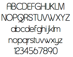
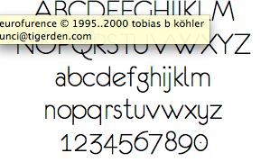
Fonts for the Company

Tuesday, February 10, 2009
Weekly Post 16
South Africa World Cup 2010 Logo
http://www.iol.co.za/index.php?set_id=1&click_id=139&art_id=vn20060722084852450c455144
The producer of the logo believed that it was the strong African identity of his logo that appealed to the judges. The footballer doing the kick was done in a San or rock painting style to bring the focus back to South Africa and its identity as "The Cradle of Human Kind". The convergence of lines towards South Africa in the continental image is intended as a metaphor to represent the diversity and energy of African soccer flair. The South African identity was further strengthened by incorporating the South African flag colours into the design. This is the reason why many people believe this logo will really enlighten the World Cup 2010.
Tuesday, February 3, 2009
Weekly Post 15
The Vancouver 2010 Logo
http://agonist.org/Learning-Center/The_Vancouver_2010_Logo_and_Campaign.htm
The The Vancouver 2010 logo was a big part of a campaign to win the 2010 winter Olympics. Its design features the two-dimensional representation of the traditional sculpture made up of block-like shapes in colors that represent the different geographical regions of Canada. The blue and greens of the design are meant to represent the unique coastal regions and forests of the country and its surrounding picturesque islands. The red symbolizes Canada’s maple leaf flag, and the yellow is meant to represent the famous Canadian sunrises. The block-like construction of the logo also symbolizes images of hockey player uniforms, making it an even more perfect symbol for Canada and for the winter Olympics as a whole. In my opinon, this is what I call a good logo since the colors and shapes all have to do something with Canada. Unlike the Adidas logo or the London 2012 logo, this logo actually fits the purpose of the campaign and is a very eye-catching emblem for the grand Winter Olympics.
Thursday, January 29, 2009
Explanation of the Fonts


Wednesday, January 28, 2009
Tuesday, January 27, 2009
Weekly Post 14
The Analysis of the Design of the Apple Website
http://www.intowebmarketing.co.uk/website-analysis-apple-mac.html
Tuesday, January 20, 2009
Weekly Post 13
Fifa O9 Review
http://xbox360.ign.com/articles/913/913467p1.html
The latest Fifa console game has been improved quite dramatically comparing it to its previous games. New animations, sound effects and graphics were added to make the game as polished as possible. For examples, players in open space will call for the ball while defenders will raise their hand to alert the referee that is an offside-ball. As a result Fifa 09 is seen as the most realistic football game to date.
Thursday, January 15, 2009
Tips for Designing
Tuesday, January 13, 2009
Weekly Post 12
Gears of War 2 Review
http://xbox360.ign.com/articles/926/926305p1.html
This review article presents all the cool features in the new and exciting video game, Gears of War 2. This game, which received a 9.7 rating from IGN, contains a lot of modern graphic designs. The producers of this game did their best to improve the game play and design of the video game and making as flawless as possible. By doing this, they improved the sound effects, the visual graphics and of course the story-line of the game.
EcoGen Brief
The company will import environmentally friendly products, we would sell the Eco Ball, Dryer Ball, Magno Ball and the Eco Stapler. Our target consumers are the low income families who want to save up to Fr500 every 1000 washes they do. We will also target people who are environmentally conscious and want to help the environment. With the Eco Stapler our target audience are companies who want to become environmentally friendly and people who want to save resources. We envision selling the products that we import in established Swiss stores and to assist people to become more environmentally conscious by offering them Eco friendly goods.


