Thursday, November 27, 2008

Smiley

It was quite tricky creating the smiley, since we had to follow steps on a video which lacked clarity and explanation. However, I managed to create a similar smiley than the one in the video. As the smiley kept developing, the harder the steps became. The hardest step was probably creating the teeth. I had trouble putting the teeth behind the outline of the mouth. Another difficulty I had was  creating the eyes. Using photoshop is not really my best thing to do. I couldnt copy the eye after creating one completed eye. As a result, I had to repeat the step without making the eyes 100% identical. At the end, I managed to make a fine looking smiley with a hat. I was happy with my achievement and this lesson will guide me when I am creating my logo for my company later on. 

Smiley

Tuesday, November 25, 2008

Weekly Post 8

The Apple Logo

http://www.logoblog.org/apple_logo.php

I learned a lot of fascinating things about the apple logo in this article. This is probably one of the most interesting articles I have read so far about graphic design. I learned a lot of things such as the first apple logo, which was also called the "rainbow apple" because it had multi-colored stripes. The designer of this logo, Rob Janoff, wanted to honor the discoveries of gravity and the separation of light with this logo. As a result, Isaac Newton plays a role in the logo, since he was the scientist who found out about the gravitational force when he observed the apple falling on his head. Rob Janoff might also tributed the "Fruit of the Tree of Knowledge" from the biblical story of Adam and Eve. Other people believed other things. For example, the multi-colored logo was used to advertise quality of colors on the Apple computers. This article also talks about the other apple logos like the polished chrome logo and the famous white and raw aluminum logo. This article might also be handy to me during the next topic in Digital Design, logo designing.

Color Codes

a chart with all web-safe colors listed

Thursday, November 20, 2008

Color Schemer

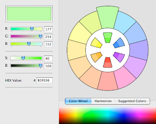
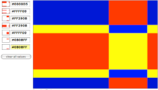
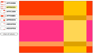
Color schemer is a brilliant program for building cool and new color schemes. It is a very easy program to use and can build new color schemes very quickly. It is a very helpful tool for designing. 

Color schemer can also edit the colors of picture and manipulate the hues and the contrast of the colors. It is quite fun to play around with. 


Peter Piper's Palette Picker

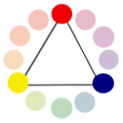
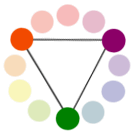
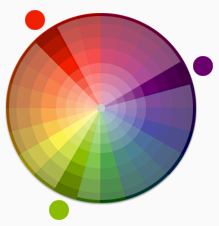
Triad Relatioship


Analogous Relationship


Split Complementary Relationship


Color Shades and Tints


Using a color wheel divided into various shades and tints is one method of identifying possible options for color schemes.

shades and tints

Color and Contrast

Every visual presentation involves figure-ground relationships. This relationship between a subject (or figure) and its surrounding field (ground) will evidence a level of contrast; the more an object contrasts with its surrounds, the more visible it becomes.

When we create visuals that are intended to be read, offering the viewer enough contrast between the background (paper or screen) and the text is important. If there is not enough contrast between figure and ground, a viewer will squint to view the text, causing eye fatigue.

Color Wheel

twelve color wheel

Primary Colors:
 Colors at their basic essence; those colors that cannot be created by mixing others.
primary colors
Secondary Colors: Those colors achieved by a mixture of two primaries.
secondary colors
Tertiary Colors: Those colors achieved by a mixture of primary and secondary hues.
tertiary colors
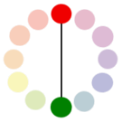
Complementary Colors: Those colors located opposite each other on a color wheel.
complementary colors - red and green
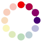
Analogous Colors: Those colors located close together on a color wheel.
analogous colors
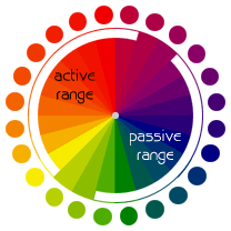
The color wheel can be divided into ranges that are visually active or passive. Active colors will appear to advance when placed against passive hues. Passive colors appear to recede when positioned against active hues.
color wheel displaying active - passive ranges

Color Basics

Color is the perceptual characteristic of light described by a color name. 

chroma-saturationintensity-value

Chroma: How pure a hue is in relation to gray 
Saturation: The degree of purity of a hue. 
Intensity: The brightness or dullness of a hue. One may lower the intensity by adding white or black. 
Luminance / Value: A measure of the amount of light reflected from a hue. Those hues with a high content of white have a higher luminance or value.

Shade and tint are terms that refer to a variation of a hue.

shadetintShade: A hue produced by the addition of black. 
Tint: A hue produced by the addition of white.

Wednesday, November 19, 2008

The Meaning of Colors

Every color has a different meaning in every culture and religion. As a result, colors play an important role in our lives since they represent different characteristics. In web designs, colors are essential and should relate to the purpose of the website. However when designing websites, colors should not be extreme. Using tints, tones and shades of colors will make the design more interesting. Rougher surfaces can make the color darker and smoother surfaces can make the color brighter. Therefore altering colors are important in web design. 

Colors

Red : Energy, strength, passion, eroticism, cheerfulness, courage, element of fire, career goals, fast action, lust, desire, blood, vibrancy, driving forces, risk, fame, love, survival, war, revolution, danger, aggression, strength, power, determination, emotional intensity, sex, provoking, dynamic, stimulating, courage, bravery, good-tasting, force, leadership, drama, excitement, speed, heat, warmth, violence, attention, generosity, romance

Pink : Romance, love, friendship, femininity, truth, passivity, good will, emotional healing, peace, calming, affection, emotional maturity, caring, nurturing, sweet tasting, sweet smelling, ethereal, delicacy. 

Orange : warmth, energy, balance, enthusiasm, vibrancy, vitality, expansiveness, flamboyance, excitement, business goals, property deals, ambition, career, goals, general success, justice, legal matters, selling, action, attention-grabbing, the sun, friendly, inviting, intense, joy, strength, endurance, steadfastness, tropics, quick movement, wealth of the mind and knowledge, charity, growing things, fascination, friendliness, happiness, beginnings, heat, creativity, autumn, determination, attraction, success, encouragement, courage, earth, mental and appetite stimulatant, emotional lift, assurance, social force, health, warmth, attractiveness, cheerfulness, mood-lightening, uninhibited, independence, amiability, constructiveness, self-assuredness, cheap, low-budget, fun kids colour, youth

Brown : friendships, special events, earth, materialistic thoughts, hearth, home, outdoors, inexpensive, reliability, credibility, comfort, endurance, stability, simplicity, comfort, longevity, intimacy, tranquility, masculine, nurturing, contentment, strength, sensuality, productivity, passivity, fertility, generosity, dirt, substance, practicality, hard work

Gold : wealth, god, winning, safety, masculine power, happiness, playful humour, prestige, wisdom, love of spirit, meaning, purpose, awe, spiritual love, quests of the heart, desire for power, mystic powers, higher mathematics, sciences, attainment, concentration.

Yellow : sun, intelligence, light, accelerated learning, memory, logical imagination, social energy, cooperation, organisation, breaking mental blocks, sunshine, joy, happiness, intellect, energy, cheerfulness, optimism, purity, enthusiasm, warmth, honour, loyalty, mental force, clarity, perception, understanding, wisdom, dishonesty, betrayal, jealousy, covetousness, deceit, disease, weakness, caution, cowardice, follower, curiosity, mellowness, confidence, humour, dreams, creativity, desire to improve, action, idealism, optimism, imagination, hope, summer, philosophy, uncertainty, restlessness, glory, enlightenment 

Green : earth mother, physical healing, monetary success, abundance, fertility, tree & plant magic, growth, food, hope, personal goals, resurrection, renewal, youth, stability, endurance, freshness, nature, environment, tranquil, refreshing, quiet, hope, immortality, health, healing, good luck, renewal, youth, jealousy, inexperience, trees, grass, vigour, growth, harmony, responsiveness, generosity, safety, envy, misfortune, quietude, compassion, renewal, moderation, nurturing, diplomacy, calm, contemplation, joy, love, abundance, balance, self-control, inexperience, hope, good omens, soothing, sharing, dependability, friendliness 

Turquoise : calming, emotional healing, protection, refreshing, sophisticated

Blue : good fortune, communication, wisdom, protection, spiritual inspiration, calmness, reassurance, gentleness, fluidity, water, sea, creativity, peace, calming, higher thoughts, mystery, sky, formality, travel, devotion, progress, quiet wisdom, freedom. betterment of humanity, love, trust, loyalty, intelligence, reassurance, artistry, compassion, inner strength, devotion, depression, sadness, tranquility, stability, unity, truth, understanding, confidence, acceptance, conservatism, security, cleanliness, order, comfort, cold, technology, devotion, harmony, depth, faith, heaven, piety, sincerity, precision, intellect, sadness, consciousness, speech, messages, ideas, sharing, cooperation, idealism, sincerity, empathy, relaxation, affection, inspiration, friendship, patience, contemplation, infinity, harmony, non-threatening, dependability 

Purple : influence, third eye, psychic ability, spiritual power, self assurance, hidden knowledge, dignity, high aspirations, royalty, spirituality, nobility, ceremony, mystery, transformation, wisdom, enlightenment, sophistication, cruelty, arrogance, intuition, dreams, unconscious, invisible, telepathy, empathy, imagination, deja vu, universal spirit, spiritual connection, deeper truth, nobility, wealth, extravagance, dignity, independence, magic, creativity, energy, self-confidence, ego, ambition, fame, luxury, big profits, richness, sensuality, elegance, contemplation, meditation, majesty, lesbianism, Wicca, New Age spirituality, paganism, conceit, arrogance, nausea

White : spirituality, goddess, peace, higher self, purity, virginity, reverence, simplicity, cleanliness, humility, precision, innocence, youth, birth, winter, snow, good, sterility, cold, clinical, sterility, clarity, perfection, innocence, virginity, goodness, light, fairness, safety, positivity, faith, coolness, charity, successful innovations, union, self-sacrifice, holiness, feminine divinity, pristine, chastity, positivity 

Silver : glamous, distinguishment, high tech, industrial, graceful aging, telepathy, clairvoyance, clairaudience, psychometry, intuition, dreams, astral energies, female power, communication, goddess, ornate riches, sleekness, modernity

Grey : security, reliability, intelligence, staid, modesty, dignity, maturity, solid, conservative, practical, old age, sadness, boring, practicality, professional, sophisticated, durability, quality, quiet, conservativeness, gloominess, sadness

Black : protection, repelling negativity, binding, shapeshifting, power, sexuality, sophistication, formality, elegance, classy, wealth, power, mystery, fear, evil, anonymity, unhappiness, depth, style, evil, sadness, remorse, anger, underground, modern music, space, high quality, bad luck, formality, reservedness, dignity, elegance, secretiveness, fear of the unknown, night, emptiness, dirtiness, sophistication, strength of character, dramatic, authority, prestige, grief, anger, reliability, strong, classic, strength, anti-establishment, modernism, serious

Thursday, November 13, 2008

Rationale of Poster

Sakktivel Elangovan

Digital Design

My poster was designed in the style of the iconic graphic designer, Peter Saville. I utilized the main principles of his work including using a vast variation of colors, large amount and variation of forms, especially circles and ellipses, and contrast. The text which is included in the poster explains the style of Peter Saville. The font of the text that I used was a very modern font, since Peter Saville was a graphic designer during the modernist movement and was a strong follower of Modernism.  Furthermore, I also warped the text because Peter Saville didn’t believe in order and alignment. Consequently, I made sure that there wouldn’t be any straight lines existing in my poster.  I used Adobe Photoshop, definitely the best software to use for graphic designing, to design my poster. The main tools that I used were the warp tool, to warp the shapes. These warped shapes in my poster come from his designs “Color and Form” and  “Waste Painting”.Using my knowledge and the skills that I learned with Photoshop, I created random shapes and added as much color and contrast as possible. My poster had a dark background since most of Peter Saville’s album covers have either a black background or another dark color. In my opinion, this dark background plays an important role in the distinctionof colors and the contrast that Peter Saville so often uses in his designs because all the other colors on the poster are light and neon. For example, yellow, light green, light blue and orange. In addition, most of the posters and album covers of Peter Saville have a body or body part of a woman included. As a result, I took the simple shapes of hands and feet that were incorporated in the Photoshop package.The multi –colored (rainbow) beams coming out from the bottom of the poster were added because this was one of the techniques that Peter Saville used in his designs to show contrast. Moreover, he always used these beams (basically just rectangles) when there was text included in his designs. Since he mainly designed album covers, most of his designs didn’t contain a lot of text.  My poster follows most of the principles of neo-classicism too. In my opinion, this is very important since Peter Saville also designed his works using the principles and was deeply inspired by Jan Tschichold. 

Tuesday, November 11, 2008

Weekly Post 7

Graphic Design Using Color

http://ezinearticles.com/?Graphic-Design-Using-Color&id=16

This article caught my eyes the first time I saw it. This article is very useful for anyone who has trouble with choosing the correct color in any of their designs. This article shows what color represents what characteristics. For example, blue represents "dependable" and purple represents "dignity". In addition, the article provides with recommendations and tips about what colors you should combine. In this article, they said not to use black and green together since black means to mourn and bad luck and green means sick. Therefore having green and a black background for an advertisement would be the worst choice since anyone who reads the ad will just have negative opinions about you. This is why this article is good and since we are creating posters ourselves as a part of our projects, this will be quite handy to me.

Wednesday, November 5, 2008

Bibliography of Project

Bibliography

Peter Saville Talks About Design

This site was definitely my most useful source since it contains a lot of valuable information about Peter Saville, the graphic designer I am researching about, including quotes, dates and pictures.

http://www.bbc.co.uk/manchester/arts/2004/01/22/saville_iv1.shtml


Facts about Peter Saville

This website plays an important role in my bibliography because it’s filled with statistics and pictures that I can use in my poster.

http://www.nationmaster.com/encyclopedia/Peter-Saville


The Graphic Design of Peter Saville

A very reliable and important resource since this website is specified mostly on the graphic design of Peter Saville and explains where he got his inspiration from and how he has influenced the industry of design.

http://www.btinternet.com/~comme6/saville/biography.htm 


Peter Saville: A Graphic Designer

Consisting of very limited but unique information, this website presents the history and the general information about Peter Saville and tends to be quite handy.

http://www.showstudio.com/contributors/335


An Interview With Peter Saville

In this one-on-one interview, Peter Saville expresses a lot of his thoughts and ideas quite descriptively and gives me a better understanding of his genre of designing.

http://mocoloco.com/ambient/2005/10/interview_peter_saville_1.php  


Factory Outlet: Little White Lies (Interview with Peter Saville)

A very long but informative interview that provides me with important statistics and explanations about the graphic design style of Peter Saville.

http://www.btinternet.com/~comme6/saville/interview6.htm


Tuesday, November 4, 2008

Weekly Post 6

Google Chrome

http://www.readwriteweb.com/archives/google_to_offer_its_own_browser_chrome.php

This article about Google Chrome is not very informative and fairly short. However I still think it is quite a good article. It explains all the features of Google Chrome, Google's own web browser, in one sentence. In addition this article is also trying to persuade us to choose Google Chrome instead of any other web browser, especially Firefox.

Some of the new features on this browser include, having quick navigation, gears integration, open sources, smart memory management and crash-free app browsing. This article definitely gives me the interest to download this new web browser and use it as my default browser. However, after hearing about the problems about Google Chrome lately, I have completely deleted the application from my computer.