skip to main | skip to sidebar

Peanut Butter and Jelly

Wednesday, September 10, 2008


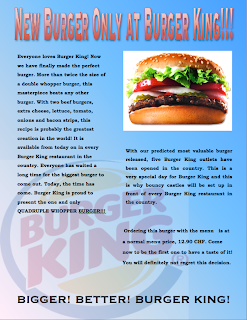
I completely adjusted the alignment and proximity. Firstly, I made the font size smaller and had adjusted the spacing between each line so that overall the advertisement would have more space (resulting in a better design). I changed the alignment, so that both the picture of the burger and the text underneath it would have the same alignment. 
Posted by Charlie Brown at 4:37 AM
Labels: Advertisement

No comments:

Post a Comment

Newer Post Older Post Home
Subscribe to: Post Comments (Atom)

Labels

  • Advertisement
  • class notes
  • Color
  • design101
  • EcoGen
  • Fonts
  • Foundations
  • Graphic designing
  • Logo design
  • Photoshop
  • Poster Project
  • Principles of Design
  • space
  • website
  • Weekly Post

Blog Archive

  • ►  2009 (37)
    • ►  June (5)
    • ►  April (8)
    • ►  March (7)
    • ►  February (9)
    • ►  January (8)
  • ▼  2008 (55)
    • ►  December (9)
    • ►  November (16)
    • ►  October (6)
    • ▼  September (19)
      • Weekly Homework 3
      • Examples of Helvetica
      • Weekly Post 2
      • Font
      • The last change I made to my ad, was to remove the...
      • Review
      • Weekly Post 1
      • Fireworks, logos, banners, cards, front desk, note...
      • Contrast
      • To have a fair amount of repetition in my advertis...
      • Repetition
      • I completely adjusted the alignment and proximity....
      • Alignment
      • No title
      • The Four Basic Principles
      • Proximity
      • No title
      • Discussion: What is graphic design? Why is it impo...
      • What is Graphic Design?
    • ►  August (5)

About Me

Charlie Brown
View my complete profile