Tuesday, September 30, 2008
Weekly Homework 3
This article is quite bizarre, since it illustrates all the different ideas an ipod case. It is crazy what people come up these days just for a case for an ipod. One really cool design was the bulletproof ipod case. It was quite big and didnt really look that attractive. However there were other clever ideas that I am very sure other people would like and fall in love with. For example, the 'Fluffpod', which is a furry ipod case. Another example is the 'iKitty', which is a case which is the shape of a cat. I think it is quite cool and I wonder how much it would cost. It would be something very revolutionary and would definitely draw a lot of attention. Therefore this article shows the weirdest ideas of design that people can up with these days. Design has just become such a wide interest worldwide that no one actually realises it.
Monday, September 29, 2008
Weekly Post 2
Wednesday, September 24, 2008
Font
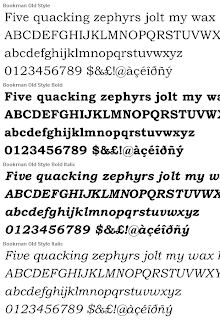
- There are six main groups of types: Oldstyle, Modern, Slab serif, sans, serif, script and decorative.
- Oldstyle - serif, serifs on lowercase are slanted, moderate thick/thin transition in the strokes,


- Modern - has horizontal instead of slanted serifs. Modern font tend to have a cold and elegant look. Has a vertical stress, serifs on lowercase letter are thin and horizontal and a have a radical thin/thick transition in the strokes.


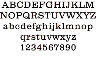
- Slab Serif - has serifs on lowercase letters are horizontal and thick, vertical stress, very little or no thick/thin transition, or contrast in the strokes.


- Sans Serif - "sans" means without in French. (Therefore sans serif fonts have no serifs on the ends of the strokes. No stress and no thick/thin contrast.


 o thick/thin transition in the strokes.
 - Script - (fonts that appear tohave been hand lettered with a calligraphy pen or brush.


- Decorative - these fonts are fun, distinctive and easy to use. Their powerful use is limited.


Tuesday, September 16, 2008
Review
- Don't be a wimp.
- Don't be afraid to create your design with plenty of blank space.
- Don't be afraid to uncenter your format - it often makes tthe effect stronger.
- Don't be afraid to make your graphics very bold.
- group related items together and vary the space to indicate the importance of a relationship.
- To keep everything unified on a page, align everything on the same edge.
- repetition helps strengthen the consistency on a page.
- add contrast by using rules, typefaces, colors or spatial relationships.
Thursday, September 11, 2008
Weekly Post 1

It was quite interesting since it was describing how a design environment should be like. It compares both a virtual and a realistic area to each other. Therefore the writer was finding similarities between websites and with realistic rooms and locations. Both the organisation of a house or a room and the organisation of a website can affect the persons perceptions and behaviours in the same ways.
Websites can be basically seen as a house. It is a simple analogy. An easy escape from the house is actually the back button on the webpage and the pages are analyzed as the rooms. To make a guest feel comfortable at your house, you have to make it attractive and comfortable at the same time. This goes the same for a webpage. For visitors to be attracted to a site, it has to be eye-catching.
Basically this article was summarizing the main principles of design. However, these principles seem to be different to the ones we learnt in class (proximity, alignment, repetition and contrast). The main visual elements of a desing that were described in this article were: color, typography, imagery, content and navigation.
In summary, a peaceful home and a nice webpage is the result of a good design. Busy and crowded websites makes it hard for people to look for information. Websites that are "sticky" and appealing are seen as an organized enviorenment with logical organisation of content. This helps visitors search for information easily. The basic goal of an organised home and webpage is to allow visitors to find what they are seeking for.
This article is actually quite helpful and I believe it will help me and guide me when its time for me to create my own webpage.

Contrast
- If two items are not the same, then make them completely different.
Wednesday, September 10, 2008
Repetition
- This repetitive element can be anything from a bold font, a thick line, a certain bullet, color, design, element, format or spatial relationships. (anything that a reader can recognize).
- Repetition can also be seen as "consistency".
- If there is no repetition in a design, it loses its cohesive look and feel.
- With repetition, visual elements in the design unifies and strengthens the design.

Tuesday, September 9, 2008
Alignment
- Every element should have some visual connection with other elements on the page.
- Unity is an important concept in design.
- Even if the separate element are not close, they can still appear to be connected by alignment.
- The purpose of alignment is to unify and organize the page.
- A strong alignment creates a sophisticated, formal, fun or a serious look.
- Find elements to align with each other, even if they are physically far away from each other.
- Try not to have a centered alignment, unless you want to have a very formal piece of design.
Thursday, September 4, 2008
The Four Basic Principles
Wednesday, September 3, 2008
Proximity
Tuesday, September 2, 2008
Discussion: What is graphic design? Why is it important?
Technology is the application and the process that helps human beings modify nature to meet their needs and wants. In simpler words, technology is a creation from science and engineering. Design and technology definitely have a very significant relationship. Looking at innovations, both technology and design are needed to produce an innovation. In the past century (mostly in the last two decades), both technology and design have been combined to generate brilliant foundations like all of the new electronic devices (IPods, phones, laptops, cameras, etc.) Even though design and technology can be seen as the same thing, they have to different definitions and often get mistaken with one another.
Whenever I see or hear the word design, I think about art, pattern, color and all the elements of fine art. But, when referring to digital design or graphic design, the word has a new meaning. Graphic design, in my opinion, is actually quite an interesting topic and shows us what we can do with the availability of technology and innovations.
| | Research method | Design process |
| Preparation for research | Literature review | Study historic and contemporary examples, media |
| Information gathering. Goal: to limit variables and identify problem | Collection of preliminary field data | Experimentation with materials and visual ideas |
| Identification of problem and hypothesis | Information correlated; problem defined; educated guesses made; hypotheses stated; research design prepared | Design problem identified through visual analysis and recognition |
| Exposition of facts and interpretation | Research plan is carried out; results are analyzed, plan is modified as necessary based on results; experiments are replicated | Work is created in a series, with each work suggesting problems to explore in subsequent work |
| Presentation of results and findings | Publication of findings | Exhibition of work or production of design |


