
Tuesday, February 10, 2009


Tuesday, February 3, 2009
Weekly Post 15
The Vancouver 2010 Logo
http://agonist.org/Learning-Center/The_Vancouver_2010_Logo_and_Campaign.htm
The The Vancouver 2010 logo was a big part of a campaign to win the 2010 winter Olympics. Its design features the two-dimensional representation of the traditional sculpture made up of block-like shapes in colors that represent the different geographical regions of Canada. The blue and greens of the design are meant to represent the unique coastal regions and forests of the country and its surrounding picturesque islands. The red symbolizes Canada’s maple leaf flag, and the yellow is meant to represent the famous Canadian sunrises. The block-like construction of the logo also symbolizes images of hockey player uniforms, making it an even more perfect symbol for Canada and for the winter Olympics as a whole. In my opinon, this is what I call a good logo since the colors and shapes all have to do something with Canada. Unlike the Adidas logo or the London 2012 logo, this logo actually fits the purpose of the campaign and is a very eye-catching emblem for the grand Winter Olympics.
Thursday, January 29, 2009
Explanation of the Fonts
This font could be used for the slogan because of it is decorative and is sans serif. This means, that it is attractive and is easy to the eye. In my opinion, this font is the correct type for the slogan of EcoGen since it fits the brief and the purpose of the company.
Font: Last Ninja
This font is a lot more different than the first font because it is a serif font, but in away. This font is called Last Ninja and has a very medieval look, however I think if I could manipulate it a bit using Photoshop, the slogan could be quite appealing.
Font: Eldorado

This serif font has a script type look, but is actually a Western and old style font. I think it fits with the brief and speaks well to the idea of the company even though the font is mean to represent the Old West.
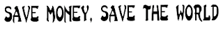
Font: Trading Post NF

This font is sans serif too and is also very modern. It could be very effective when I use it for the slogan. This font is very clean and has a good look and organization in general.
Font: Metal Lord
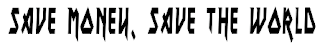
In my opinion, this font is very eye catching and serves the idea of the company. It could be very effective when it is put with the logo. In addition, this font is very sophisticated and modern.
Wednesday, January 28, 2009

Subscribe to:
Posts (Atom)