Tuesday, February 24, 2009

Weekly Post 17

The Design of the Manchester United Football Site

http://www.boagworld.com/accessibility/two_sites_are_better_than_one/

This article shows why the Manchester United Football Site might have a problem with accessibility. The author demonstrates why accessibility is so important when it comes to web designing. He believes that the Man Utd website has a hard accessibility, maintenance issue and is criticizing the idea of having a separate site after accessing the main Man Utd webpage. The author believes that the web designers are seriously alienating their target audience.

Thursday, February 12, 2009

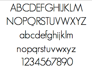
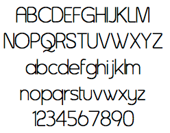
Fonts for the Company

1st Font: Asenine


2nd Font: Dream Orphans 


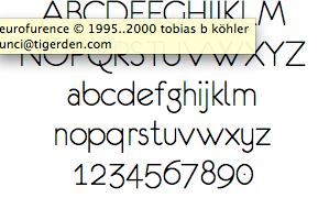
3rd Font: Eurofurence 


4th Font: Geosans 


Tuesday, February 10, 2009

Weekly Post 16

South Africa World Cup 2010 Logo

http://www.iol.co.za/index.php?set_id=1&click_id=139&art_id=vn20060722084852450c455144

The producer of the logo believed that it was the strong African identity of his logo that appealed to the judges. The footballer doing the kick was done in a San or rock painting style to bring the focus back to South Africa and its identity as "The Cradle of Human Kind". The convergence of lines towards South Africa in the continental image is intended as a metaphor to represent the diversity and energy of African soccer flair. The South African identity was further strengthened by incorporating the South African flag colours into the design. This is the reason why many people believe this logo will really enlighten the World Cup 2010.

Logo Idea 4

Logo Idea 3

Logo Idea 2

Logo Idea 1

Tuesday, February 3, 2009

Weekly Post 15

The Vancouver 2010 Logo

http://agonist.org/Learning-Center/The_Vancouver_2010_Logo_and_Campaign.htm

The The Vancouver 2010 logo was a big part of a campaign to win the 2010 winter Olympics. Its design features the two-dimensional representation of the traditional sculpture made up of block-like shapes in colors that represent the different geographical regions of Canada. The blue and greens of the design are meant to represent the unique coastal regions and forests of the country and its surrounding picturesque islands. The red symbolizes Canada’s maple leaf flag, and the yellow is meant to represent the famous Canadian sunrises. The block-like construction of the logo also symbolizes images of hockey player uniforms, making it an even more perfect symbol for Canada and for the winter Olympics as a whole. In my opinon, this is what I call a good logo since the colors and shapes all have to do something with Canada. Unlike the Adidas logo or the London 2012 logo, this logo actually fits the purpose of the campaign and is a very eye-catching emblem for the grand Winter Olympics.