Wednesday, April 29, 2009

EcoGen website explanation

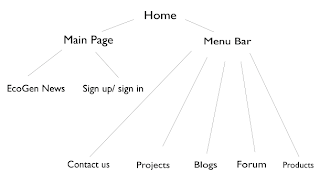
My website homepage design is quite simple and fits perfectly to the company, since EcoGen is a company which sells simple environment friendly products. The main colors that I used were blue and green, the colors of my color scheme. On the top of my website, there is a horizontal bar which include the company logo on the left, and the words "Welcome to EcoGen" in the middle. This would make the website more user-friendly. Underneath this horizontal bar, there is a tab bar, with six tabs including, "Home", "Projects", "Products", "About Us", "Links" and "Contact Us". Underneath this tab bar, there is a huge picture of my advertisement I made for EcoGen. On the bottom of the page, there is a copyright statement in yellow. That is basically the general website homepage design. All of the headings and color of the font for the tabs are black. The banner and the bar are green. Overall, there is good contrast of colors and the colors that I chose are not too hard on the eyes, but attract the eyes instead. 

EcoGen Website Design

Wednesday, April 22, 2009

EcoGen space summary

For my EcoGen space, I decided to create a small boutique in Google Sketchpad. The main elements of the boutique include having the colors of my color schemes, blue and green. In addition, I added my advertisement poster for the company on one of the walls of the space. Some of the furniture of the space include a green sofa couch, a counter, two transparent desks for the laptops and surveys, a water fountain as an icon and four plants to set the mood of the whole space. I also added a few photos of nature to hang up on the walls. I believe that all these elements and features would attract people to come and visit the EcoGen boutique. 

There are posters and pictures all over the room walls to both advertise the company and set the mood of being in "nature". There also a lot of plants and the sound of the water coming from the fountain in the middle of the room also gives this spiritual and calm feeling, which can have a very positive effect on the people who enter the boutique. 

One of the posters include the EcoGen advertisement that I made for the company. This poster is quite large in size and is in the perfect place for people to come and look at it, since there is a lot of space around the poster. The carpet of the boutique is looks like grass, since the carpet has the grassy color and texture. 

The laptops on the tables are very user friendly, since they basically have the EcoGen website and slideshows about the company available to look at. Laptops definitely attract more people to come and see the slide shows than having brochures or anything on paper. 

As a result, I believe the boutique could be a great success for the company and it could promote EcoGen a lot by attracting people to the room and allowing to learn about the company and what it does. 

EcoGen space


Weekly Post 23 (Magazine)

Graphic (e)motion

This article from Matt Woolman demonstrates how motion graphics has changed the universe of multimedia. What I found interesting about this article is that he compared a graphic artist to a painter. With this comparison, he is trying to show that in the modern world both the painter and graphic artist are hesitating and are asking questions about what tool to use instead of asking the question what is possible. A painter has to choose between the water colors, the paint brushes and paint palettes while the graphic artist has to choose which software he is going to use for animations. The author of this article explains that the methodology is more important than the tool. No matter what software or paint tool is used, the design has to attract the attention and have a meaning behind it. With this article, the author is trying to promote his book called Motion Design, which is all about the concept of motion graphics design. 

Wednesday, April 1, 2009

Weekly Post 22 (Magazine)

And yet it goes round…

Basically, this article shows us how movement has influenced the world a lot including the graphic designers. In the world of designing, anticipating movement, bodily movement and translating mobility have always been challenges for designers to tackle. In our world, transportation system is the challenge. The author gives the RATP as an example. RATP is the public transportation system in Paris and the author uses this system to show how many different ways of movement there are from just one location, Paris. There are subways, buses and the RER (high-speed train services). These systems are all provided and open for us to use by just purchasing a ticket or a pass. The author, who is also a designer, presents some of his work which represents movement. His main characteristic that he uses in all of his designs is the use of light. He believes that light is a very important quality of movement and expresses the impulse of movement very effectively.