Thursday, June 4, 2009
Wednesday, June 3, 2009
Website Rationale
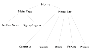
The website that I designed for the EcoGen company includes many of my previous projects including the logo, the slogan, the advertisement and the color scheme that I designed. The homepage was the first page of the website that I designed. The homepage consists of a banner with y logo on the top of the page. Every banner has a different title for each page of the website. So, on the homepage, the title is obviously Homepage. Underneath the banner is the menu bar of which includes all the secondary pages: about us, contact us, projects, products and links. Underneath the menu bar, there is a picture of the advertisement I made for the company. Additionally, there is a copyright statement on the bottom page and underneath that there is a statement, which shows when the website was last updated.
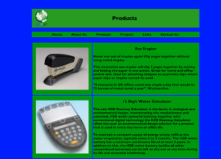
The secondary pages are very similar to the design of my homepage. The only main difference is that instead of having the advertisement, I have the main text for the pages. Every secondary page also has pictures. Furthermore, the alignment, and construction of the texts and pictures are all the same on every page.
I only created 3 tertiary pages for my website, which originate from the projects page. The tertiary pages are called wind projects, solar projects and other projects. The design and construction of the tertiary pages are different to the homepage and the secondary pages. The tertiary pages have no pictures and therefore the text has a much wider width than the secondary pages.
To create the pages, I simply used tables to make it easier for me to align all the text, banners, menu bars and pictures together. Every page has a blue background . The banner, the menu bar and the background of the text boxes are all the same green. The text itself is black, since there is no better color to create a stronger contrast with my color scheme.
Thursday, April 30, 2009
Wednesday, April 29, 2009
EcoGen website explanation
My website homepage design is quite simple and fits perfectly to the company, since EcoGen is a company which sells simple environment friendly products. The main colors that I used were blue and green, the colors of my color scheme. On the top of my website, there is a horizontal bar which include the company logo on the left, and the words "Welcome to EcoGen" in the middle. This would make the website more user-friendly. Underneath this horizontal bar, there is a tab bar, with six tabs including, "Home", "Projects", "Products", "About Us", "Links" and "Contact Us". Underneath this tab bar, there is a huge picture of my advertisement I made for EcoGen. On the bottom of the page, there is a copyright statement in yellow. That is basically the general website homepage design. All of the headings and color of the font for the tabs are black. The banner and the bar are green. Overall, there is good contrast of colors and the colors that I chose are not too hard on the eyes, but attract the eyes instead.
Subscribe to:
Comments (Atom)


